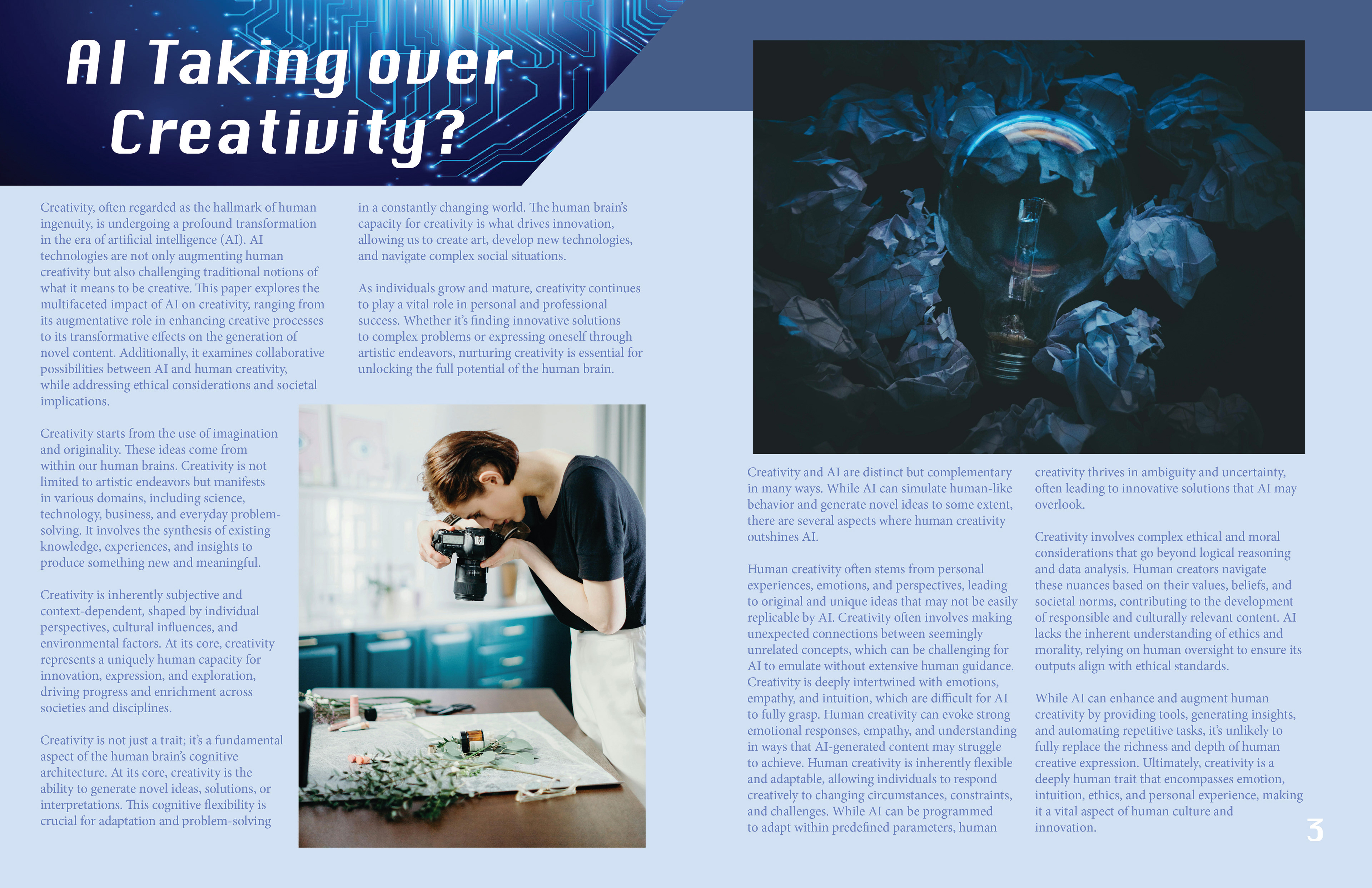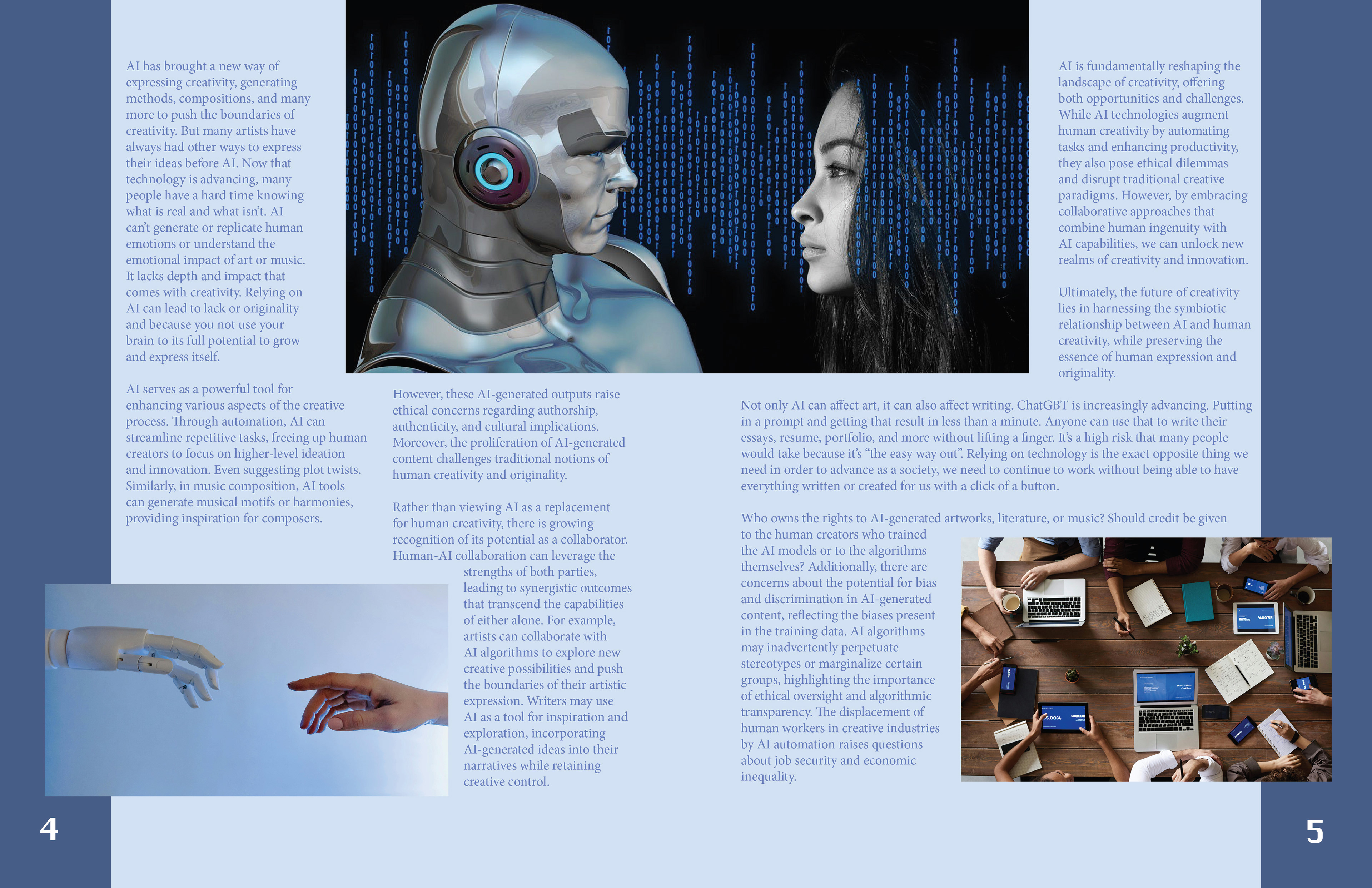
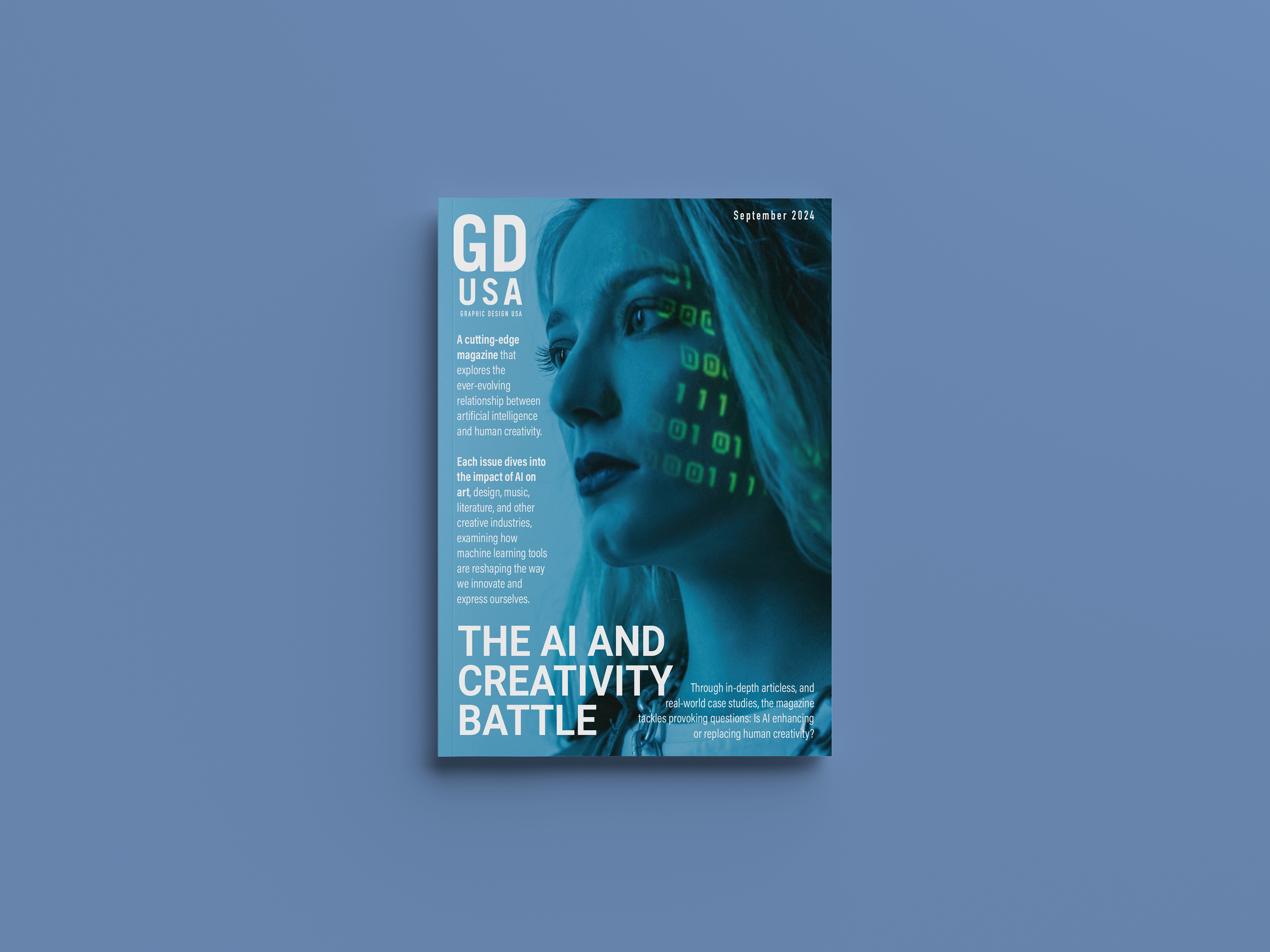
AI vs Creativity is a thought-provoking magazine dedicated to exploring the evolving relationship between artificial intelligence and human creativity. As AI continues to influence industries such as art, design, music, and literature, the magazine provides a platform to analyze its impact, limitations, and potential for collaboration with human ingenuity.
For my magazine portfolio layout, I aimed to create a visually engaging and cohesive design that effectively communicates the relationship between artificial intelligence and human creativity. The spread utilizes a balanced two-column grid layout to ensure readability and maintain an organized structure. A bold, modern sans-serif typeface was chosen for the headline to reflect the futuristic theme, while a clean, legible body font supports ease of reading. The color palette features cool, digital-inspired hues of deep navy and cyan, establishing a technological atmosphere while providing strong contrast against the text. The use of negative space enhances the overall clarity and professionalism of the spread, while consistent typography hierarchy and visual balance guide the reader through the content naturally. Each design element was thoughtfully chosen to support the article’s theme and maintain a unified, contemporary visual identity.