Selection Perfection is a conceptual restaurant brand developed to celebrate the diverse flavors of Asian cuisine through a fast-casual dining experience. The project centers around the idea of offering guests a curated journey across Asia, with a rotating menu that highlights signature dishes from various countries each month. The name Selection Perfection reflects the restaurant’s mission: to provide carefully chosen, high-quality meals that represent the richness and variety of Asian food traditions. With a friendly and inclusive atmosphere, the restaurant is designed to appeal to families, young adults, and curious foodies alike.
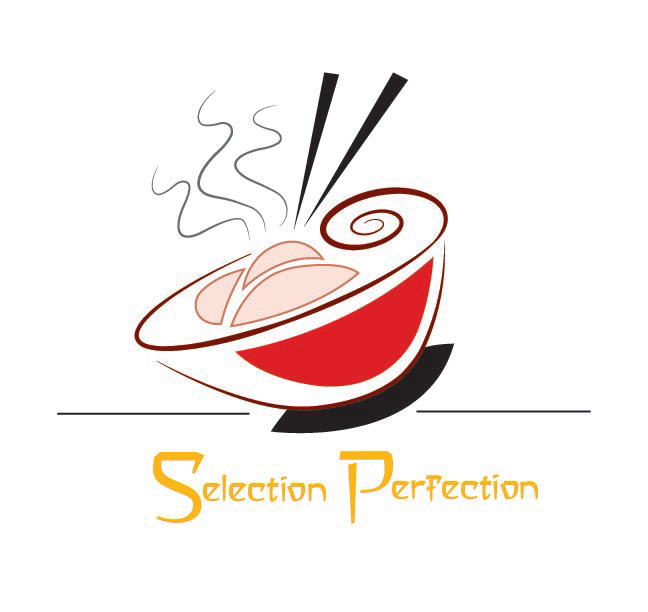
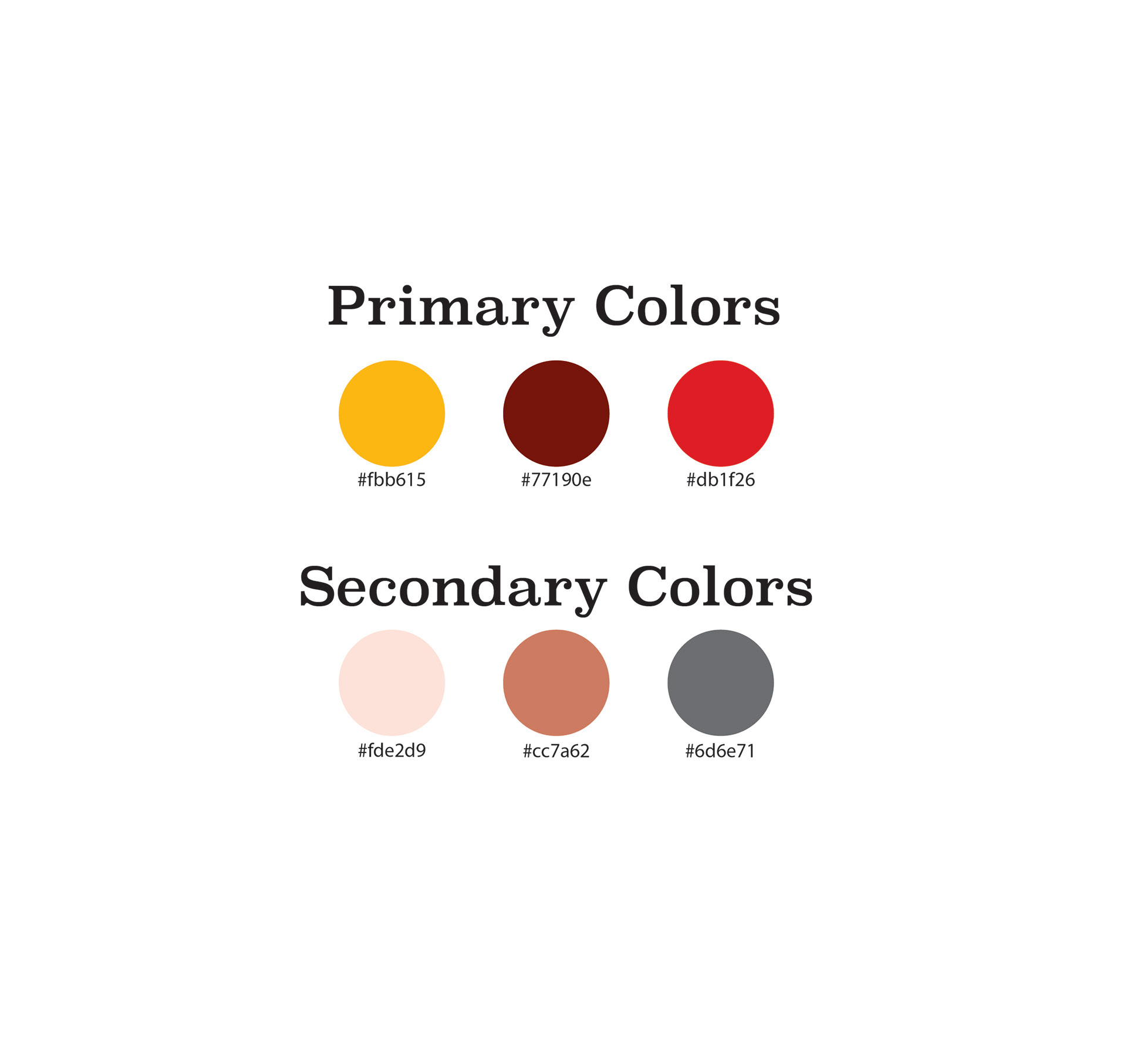
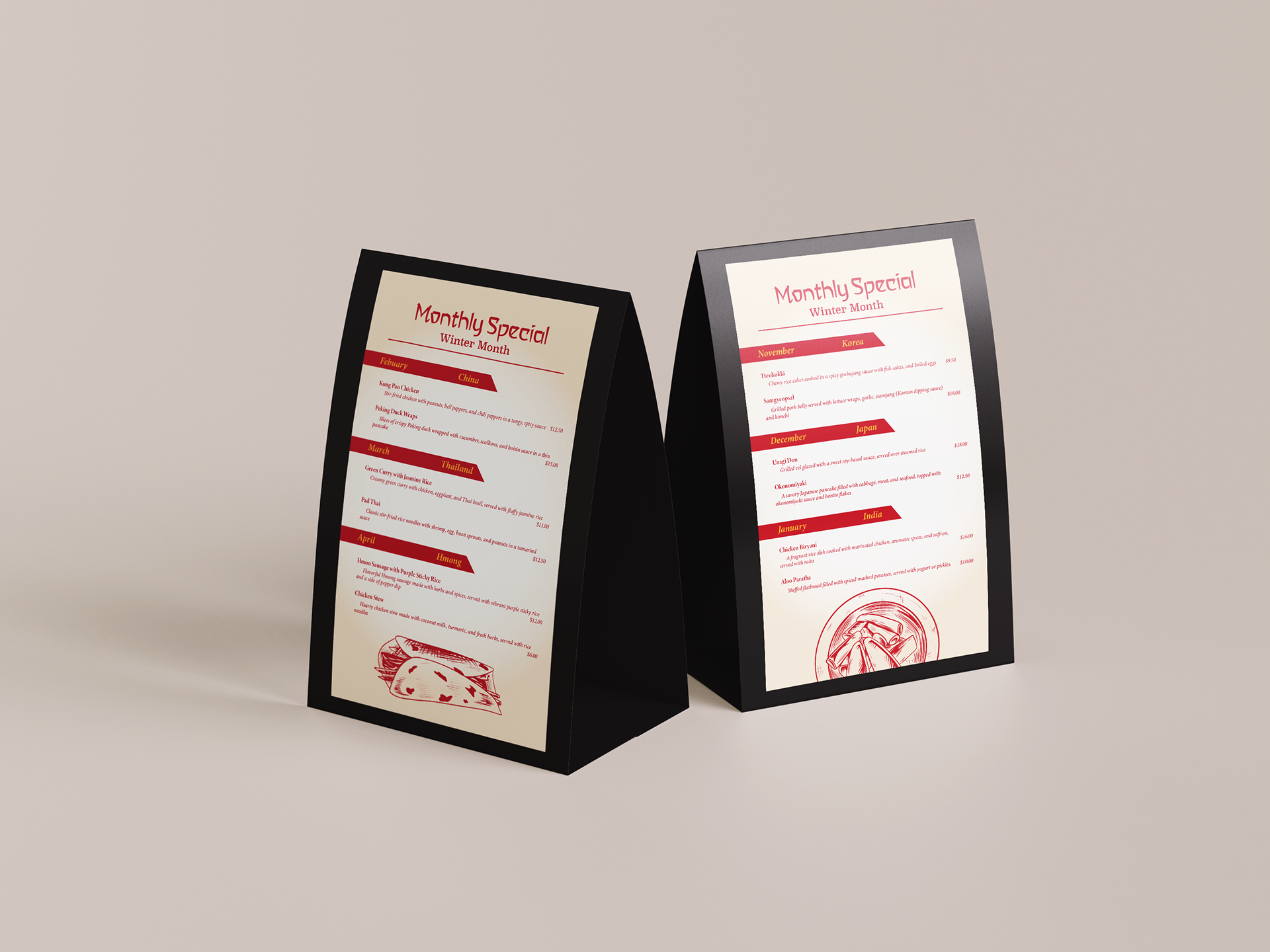
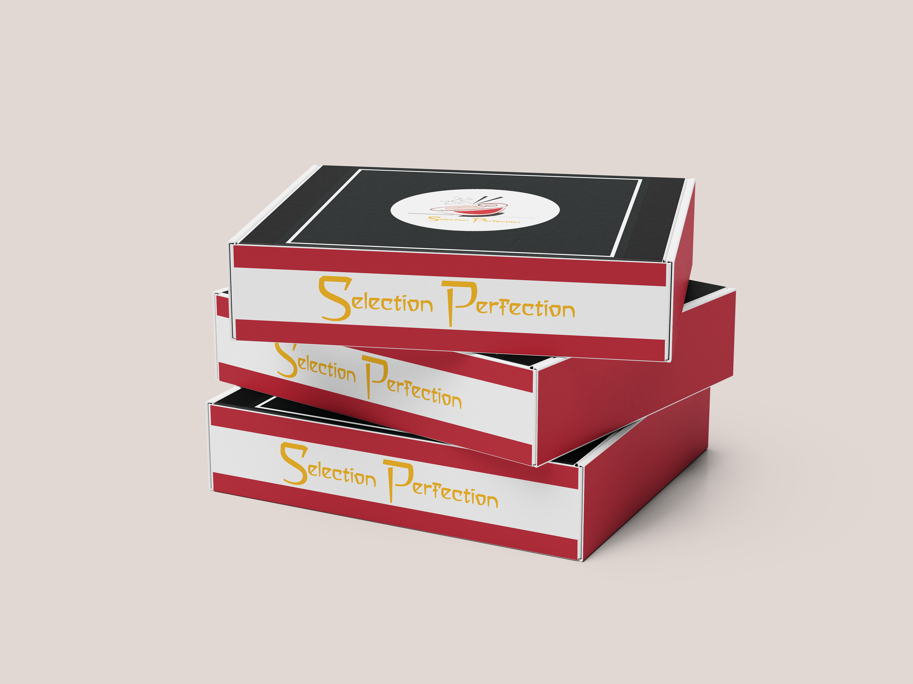
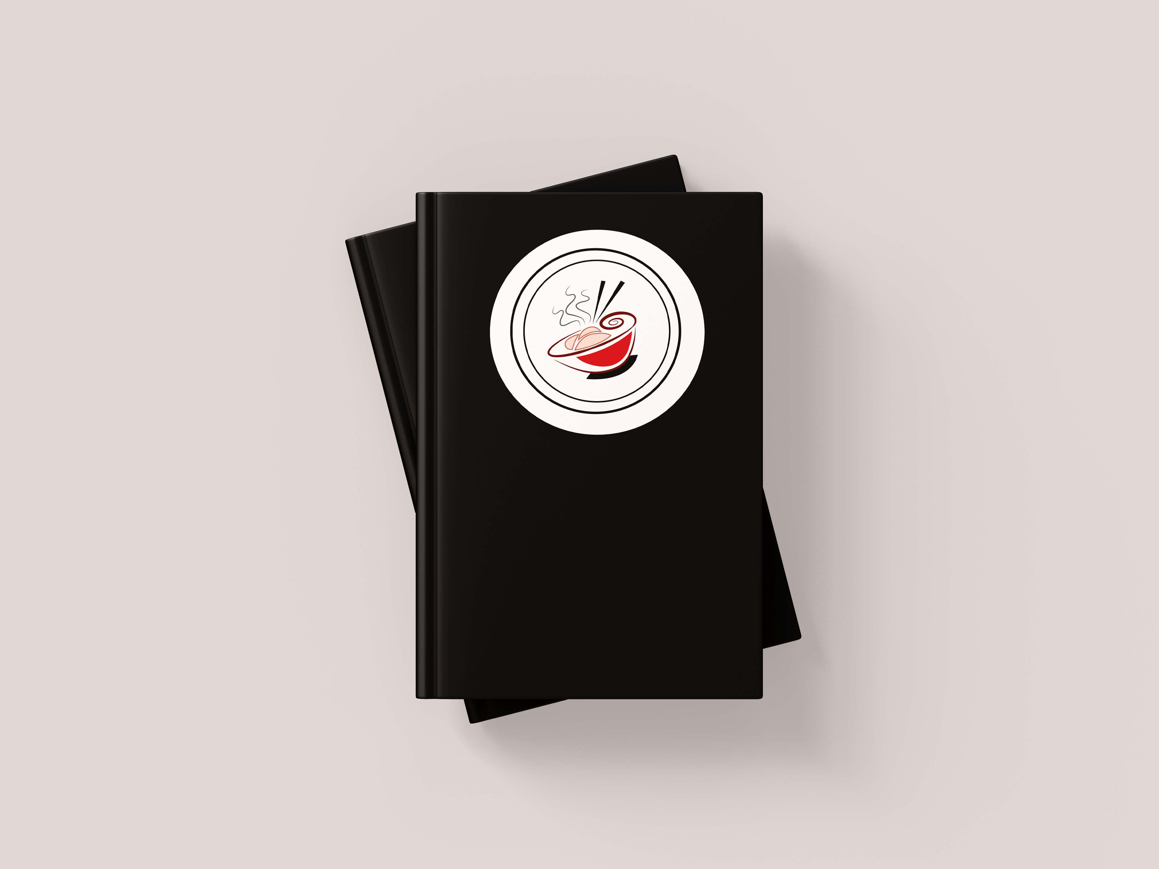
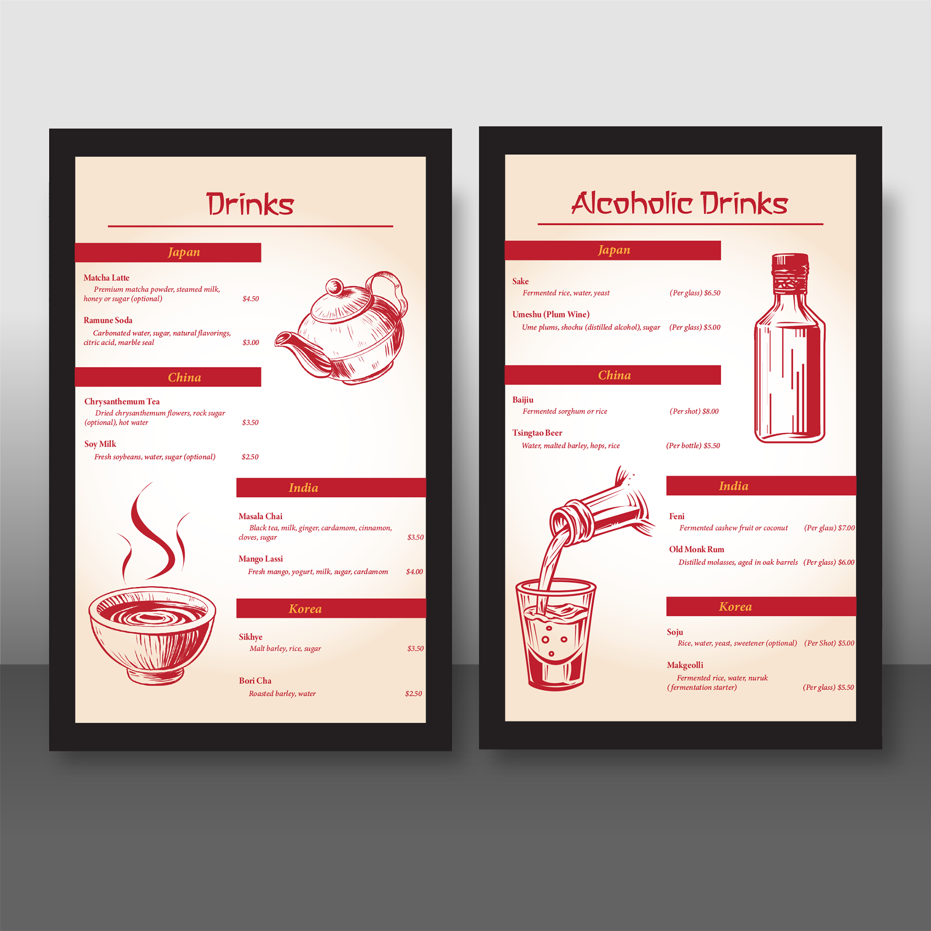
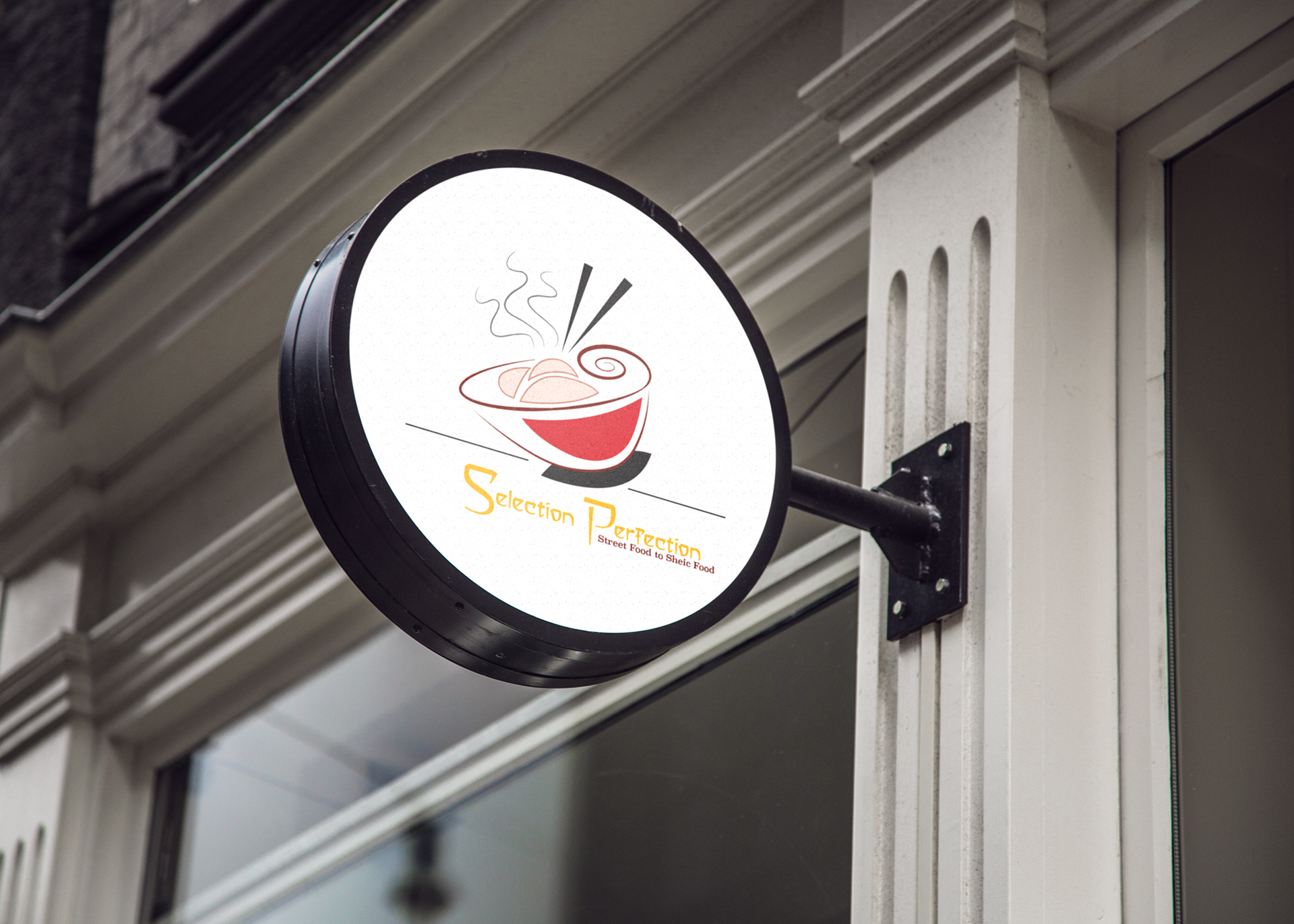
The logo design features an elegant, minimalist illustration of a steaming noodle bowl with stylized chopsticks, a sense of warmth and authenticity. The choice of red and black creates strong contrast and visual hierarchy, while the golden-yellow typography in a custom decorative typeface adds personality and sophistication, reinforcing the brand’s tagline of quality and cultural fusion. The restaurant’s sign mockup displays the logo within a circular frame for versatility and visibility in urban storefront settings, while the black menu cover mockup creates a high-end look that elevates the dining experience. The table tent and printed menu designs incorporate warm, muted backgrounds and red accent colors, guiding the reader’s eye through clearly organized dish sections by country. Subtle graphic illustrations at the bottom of the menu enhance the thematic dining concept without overwhelming the layout. Overall, the mockups demonstrate consistency in typography, color palette, and iconography, creating a unified brand experience that celebrates the diversity and elegance of Asian cuisine.