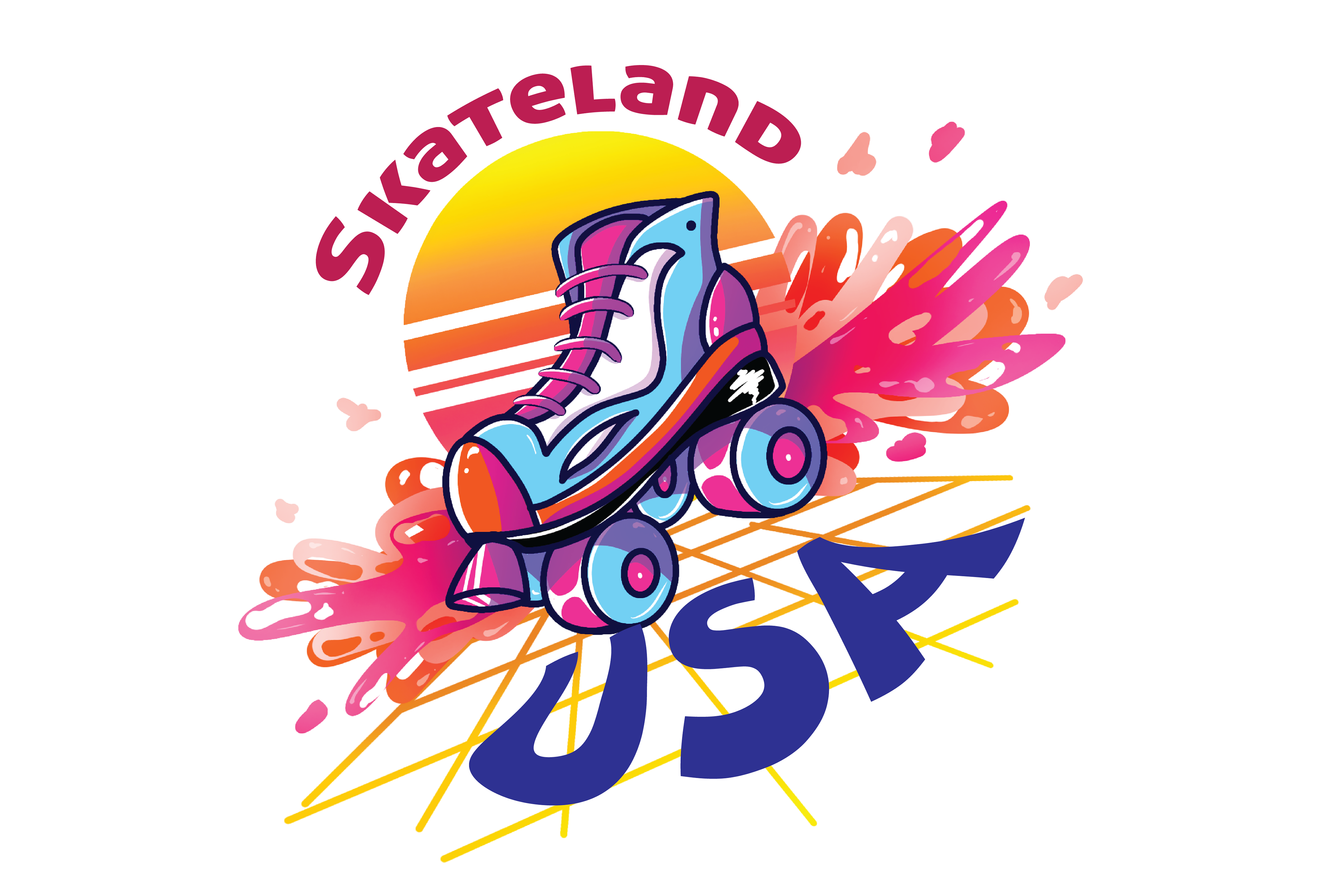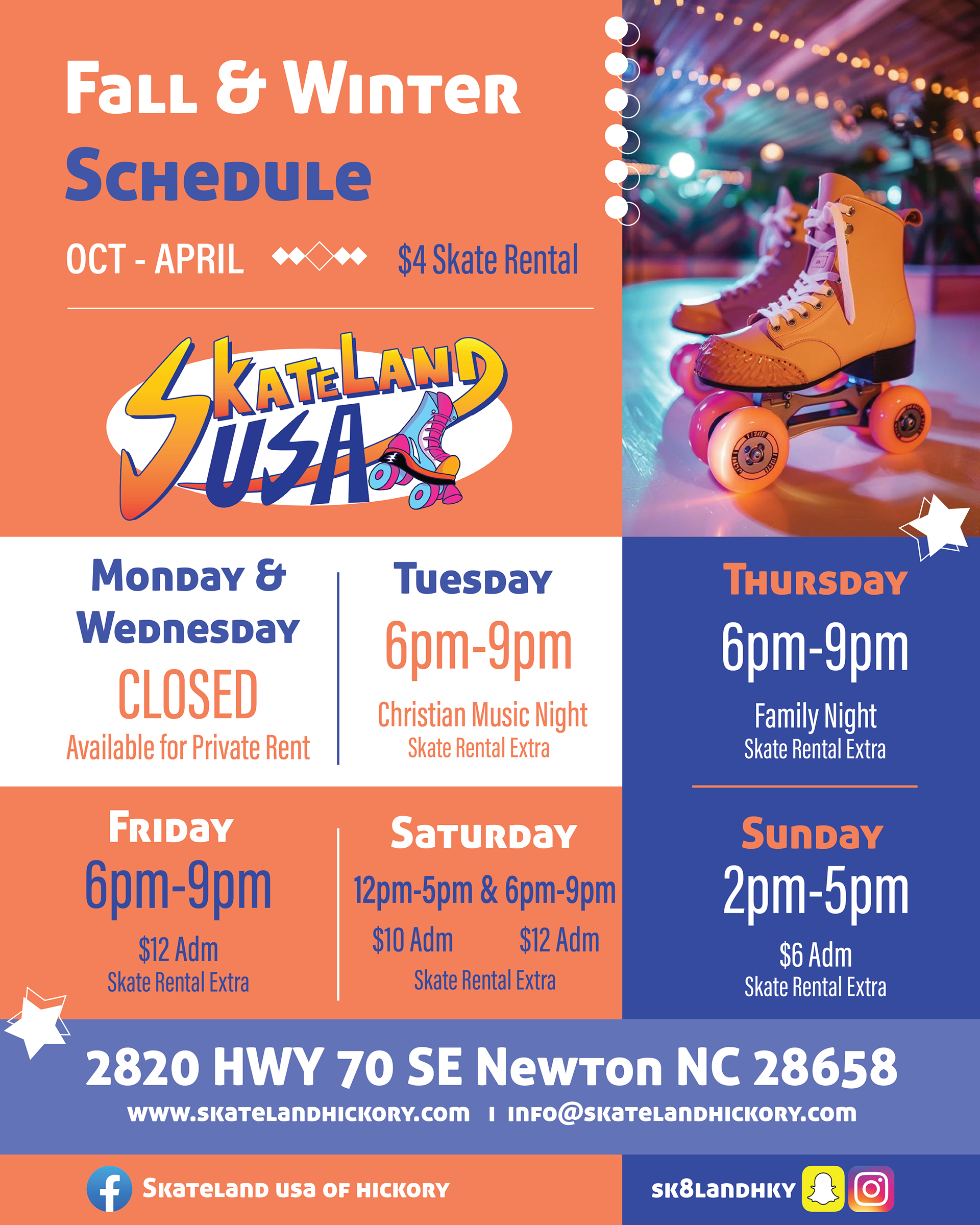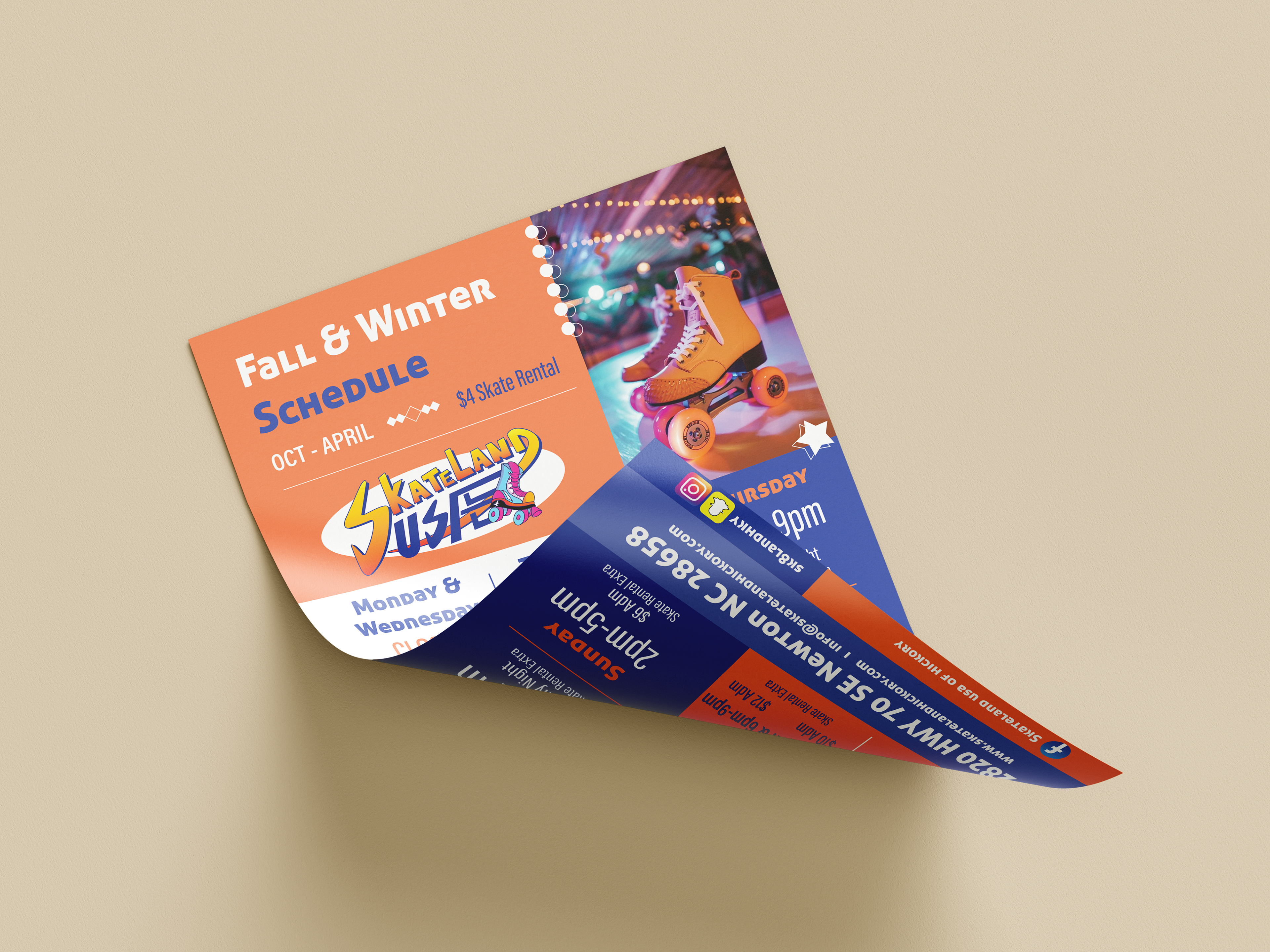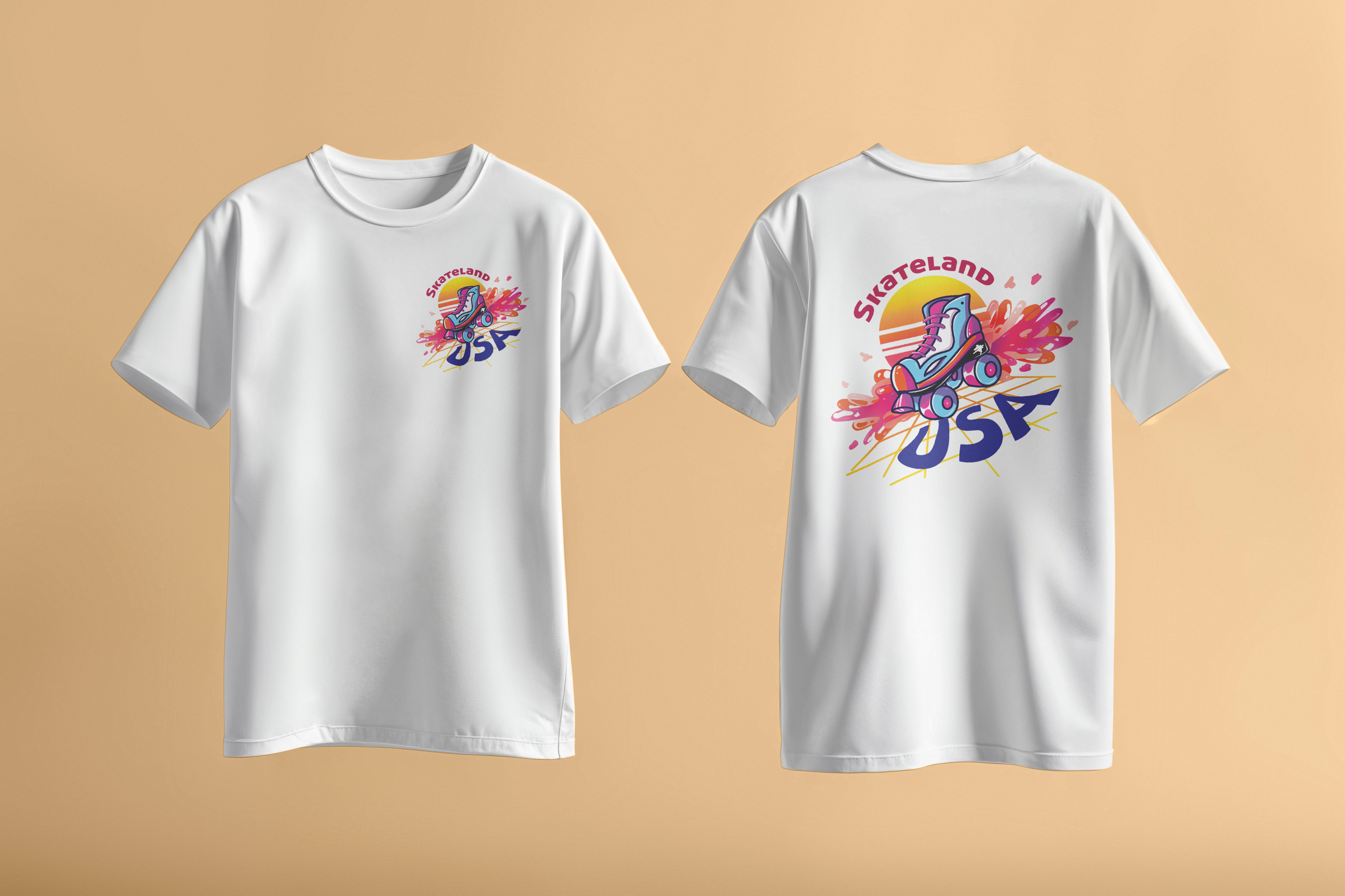
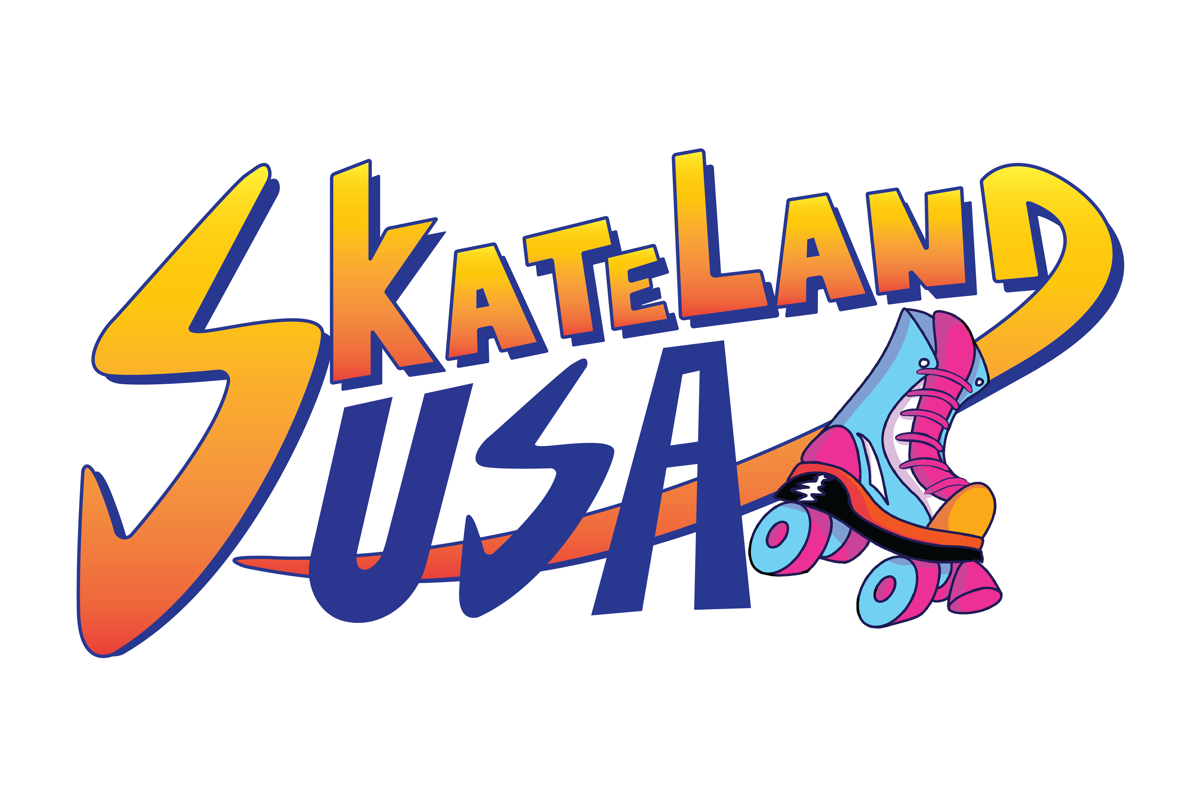
This project reimagines Skateland USA’s visual identity through a bold, energetic design system that reflects the excitement and nostalgia of roller skating culture. The aesthetic combines vibrant, retro-inspired colors with modern illustration techniques, featuring dynamic gradients, expressive linework, and playful motion elements to create a sense of movement and fun. The redesigned logo and supporting graphics, including the alternate mark and promotional schedule, maintain consistency through a unified color palette and stylized typography while allowing flexibility across different applications. The use of bold shapes, layered compositions, and high-contrast visuals enhances readability and visual impact, making the brand more engaging and appealing to a younger, experience-driven audience while still honoring its classic rink atmosphere.
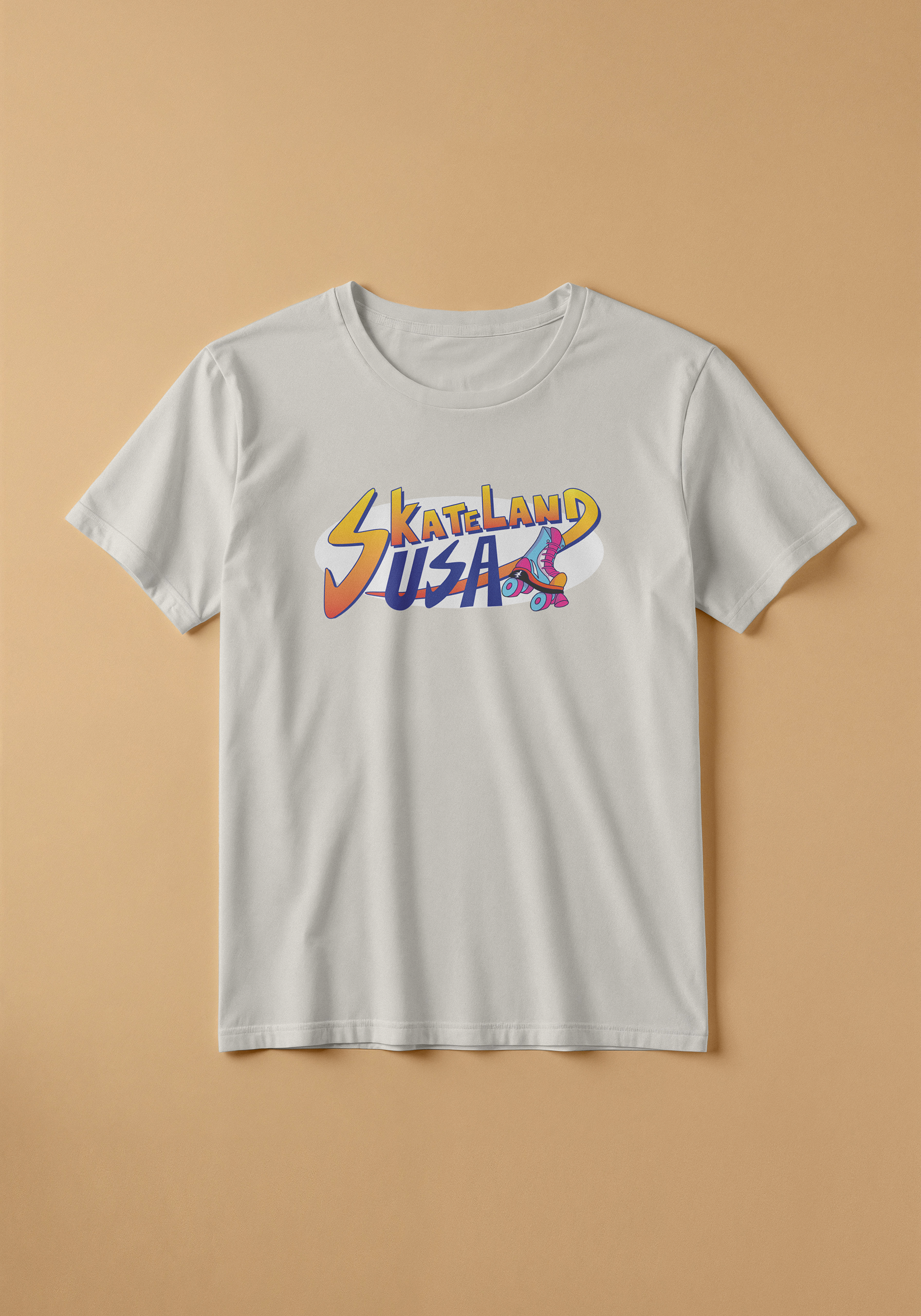
While working with the client, she wanted a neon color palette with a retro theme. The new logo I designed not only has gradients and shading, but it also shows motion with the letter "D". The color palette is visually appealing to anyone with the bright neons and contrasting dark blue as the outline. When also designing the merch, I went with a more stylistic design. Having the stripped sun in the background took inspiration from retrofuturism. Positioning the skates in a certain way helps emphasize the splashes in the background. Creating the flyer using the consistent palette helped push for my design.